Breaking down barriers
As you probably already heard, Wrapped is Spotify’s biggest global marketing campaign of the year. It’s an opportunity to celebrate listening, reward listeners and create meaningful connections between the listeners and the artists.
In 2022, over 150 million people engaged with Wrapped. And there’s no doubt this number will be even higher this year. So here’s the problem: unless we provide accessibility support, millions of users would not be able to fully enjoy this experience.
When people think about digital accessibility, they might start by thinking that it’s just screen readers, but there is a lot more to consider – for exampe, colours and text have to be easy to distinguish, buttons have to large enough to be clickable and users should be able to use many forms of user input. Accessibility is about providing an equitable experience for every user regardless of their abilities and disabilities. We want all our users to feel safe, respected and comfortable in their Wrapped experience. Achieving that not only makes it more inclusive but also expands our potential user base, making Spotify more attractive to a wider audience. So the question is: How can we guarantee an equitable experience for everyone? Read on to find out.
How do we get there?
Every year, work for Wrapped starts long before the launch. Supporting work is done throughout the year, with technical planning of the main experience starting early summer. It’s essential to think about accessibility early in the process – leaving thoughts on it for later will make things more expensive to implement, putting things at risk of being descoped when having tight deadlines. So how do we integrate accessibility into this planning process?
Collaborative is one of our core values at Spotify. Making Wrapped happen is a huge collaborative effort where many bandmates work together to build the experience. We got a road manager from each discipline to provide different perspectives. We also had the support of subject-matter experts, who helped with prioritisation and brought a lot of valuable experience from previous Wrapped campaigns and other relevant projects.
Together, we set up a simple accessibility roadmap:
-
We would start with planning activities for the work stream. As part of these, we would write guidance and identify stakeholders and road managers and kick off the processes.
-
Following that, we support the development of accessibility features for Wrapped.
-
Finally, to allow for a successful launch, we would perform a series of tasks, such as integrating accessibility into the testing processes, measuring success and documenting learnings to help us in the future.
Among the initial planning activities, we looked into standards within the industry and at Spotify. The industry standard we focussed on was the Web Content Accessibility Guidelines or WCAG for short (and yes, despite the name saying Web, it applies to mobile apps too). Spotify aims to follow the WCAG standards with level AA as a minimum. These are useful to help set our goals, but since Wrapped engineers are under time pressure, we decided to create a Wrapped Accessibility Handbook, a guide with a simple checklist that allows team members to quickly check if they have considered all the essential criteria for their feature.
Let’s build an accessible Wrapped!
Now let’s get to the exciting part… building Wrapped! Data stories are complicated to get right from an accessibility point of view by nature. Think about it… Foreground experiences that are dynamic and heavy on animations, they often involve user interactions and there’s music in the background as well.
When planning accessibility features for the data stories, there were two main parts we focussed on. The data story container, which included components such as the controls, and the data story content itself.
Data story container
As the data story container has the main means of interacting with the stories, it was essential to get it right so that everyone could experience Wrapped. In addition to some existing accessibility features, such as navigation buttons when the screen reader is enabled, we built several features to improve the experience: we added a contrasting background to the buttons and a play/pause button, so that users can more easily consume content at their own pace, and we even leveraged VoiceOver’s magic tap to control the playback.
When it comes to being compliant with the WCAG 2.1 AA and beyond, we’ve made some progress this year. We’ll focus on these two success criteria:
-
SC 1.4.3: Contrast (Minimum) (Level AA). When having a light background or animations below them, foreground controls would become difficult to see. We added an “over media” style to them, making sure that they have enough contrast at all times.
-
SC 2.2.2: Pause, Stop, Hide (Level A). When having blinking and animating content, we should provide for a way to pause that content. Previously, we could tap and hold the screen, but that was not explicit enough, so lots of users wouldn’t know, and not all users can easily tap and hold the screen (Voice Control, VoiceOver, Switch Control users) so we added a pause/play button. Users can now have more control at what pace to consume Wrapped.
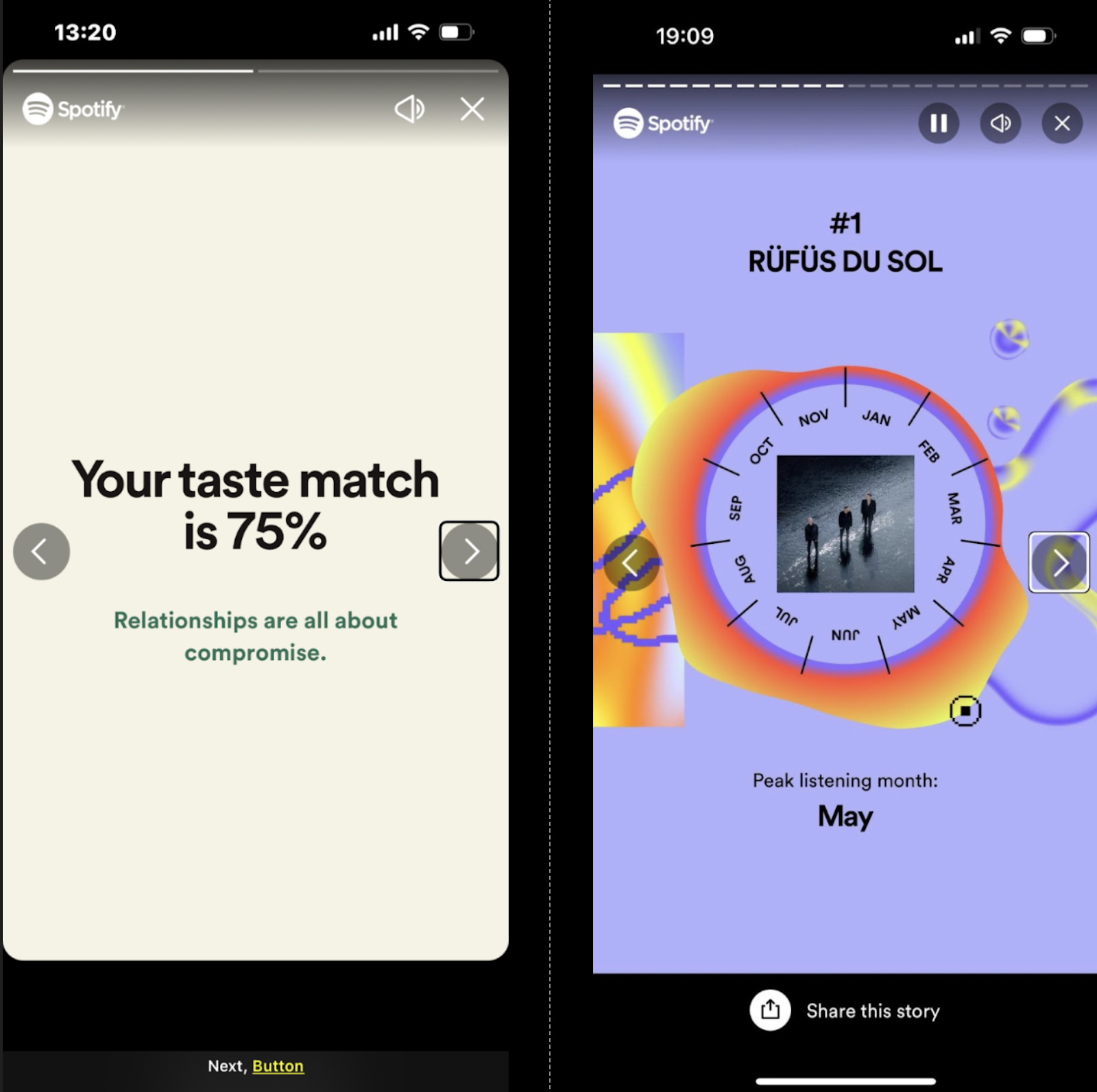
Story controls in 2022 Wrapped vs 2023 Wrapped
As this was the first year we implemented data stories on web, we had to write the experience from scratch. We added consistent navigation, a play/pause button (that uses Encore components having some accessibility foundations out-of-the-box). Like on mobile clients, we honoured the “reduced motion” setting which can be enabled to disable animations everywhere. Movement across the web page can be linear, unless the page is semantically marked up correctly. If it is not, crucial information could be missed on data stories when it is not paused. Movement could become too repetitive and fatiguing, going from navigation controls back to the story. For these reasons, we implemented a live region which serves not only to announce new content but also allow for quick jumping to it in case the reading was interrupted.
Focus management is also important to get right across areas like the share dialog. On web, focus for returning to previous screens is not managed at the system level, so developers are required to make choices on where focus opens and keep track of where it returns when the interaction is closed.
We also integrated accessibility into the planning of each data story. There were a number of challenging stories that required additional attention. To give some examples:
Summary Share Story
For the first time, we made the share cards accessible to screen reader users. Previously the entire component was invisible to these users so they would not have even known it was there! By allowing these users to experience the card, not only do we give users the chance to experience their data, but they are more likely to actually share the card to their social networks.
Top Five Story
Grouping elements in the top lists, has also made it easier for screen reader users to navigate them. In the example of “Your top songs” list, instead of saying: “One”, swipe right, “Baisaná”, swipe right, “Nia Archives”, swipe right, “Two”… etc. it just says “One, Baisaná, Nia Archives”, swipe right, “Two, Purified By the Fire, Yves Tumor”, swipe right, “Three, Barnie World (with Aqua), Nicki Minaj, Ice Spice, Aqua”, etc.
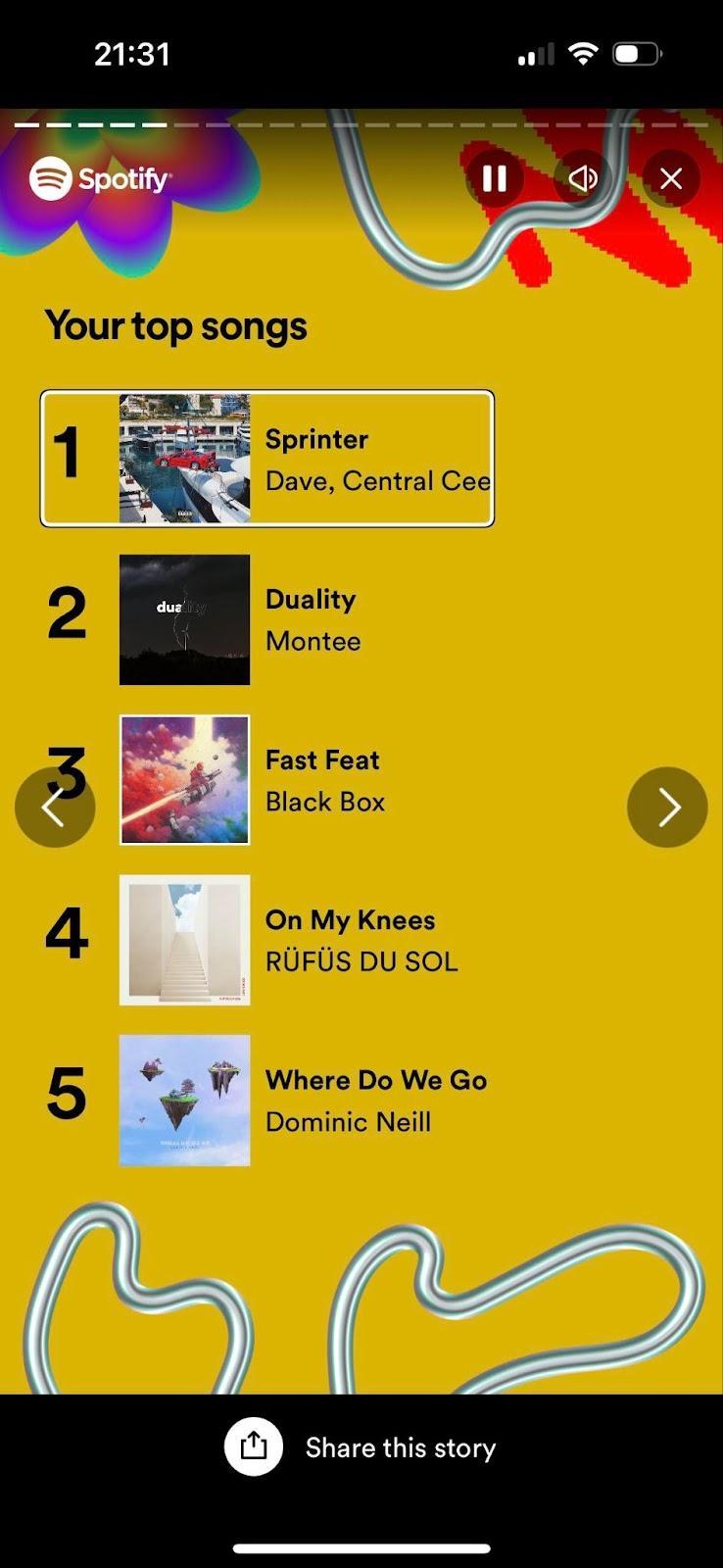
It feels more natural, it requires less interactions (4 vs 14 swipes to the right to go through all the 5 songs in the list), and it makes more sense for users that navigate by exploring the screen too.
Your Genre Sandwich Story
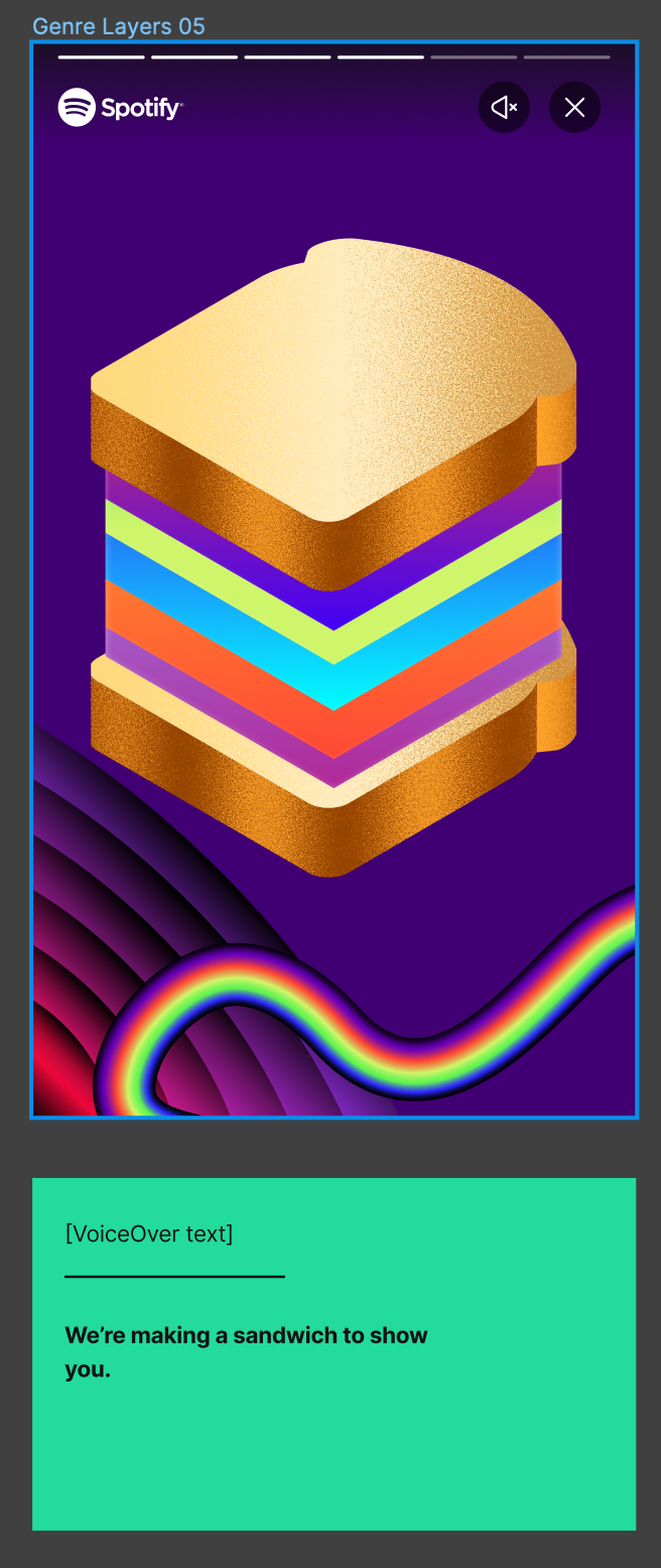
New data stories are always fun and exciting which means they’re also often really challenging. This wasn’t any different with the Sandwich story. Typically, the copy itself on the screen is sufficient for screen reader users to get full context. While in Wrapped much of the imagery serves as decoration rather than conveying relevant information, in this case if you don’t mention that it’s a sandwich, you are not conveying the playfulness of the story, and the user is missing some of the context. To address this, we had a content designer take a look at the copy for screen readers suggesting how we can present these nuances to screen reader users. If you just make the copy on screen accessible by screen reader users, you can see how the user won’t know we are building a sandwich for them (which is a big point of the story!).
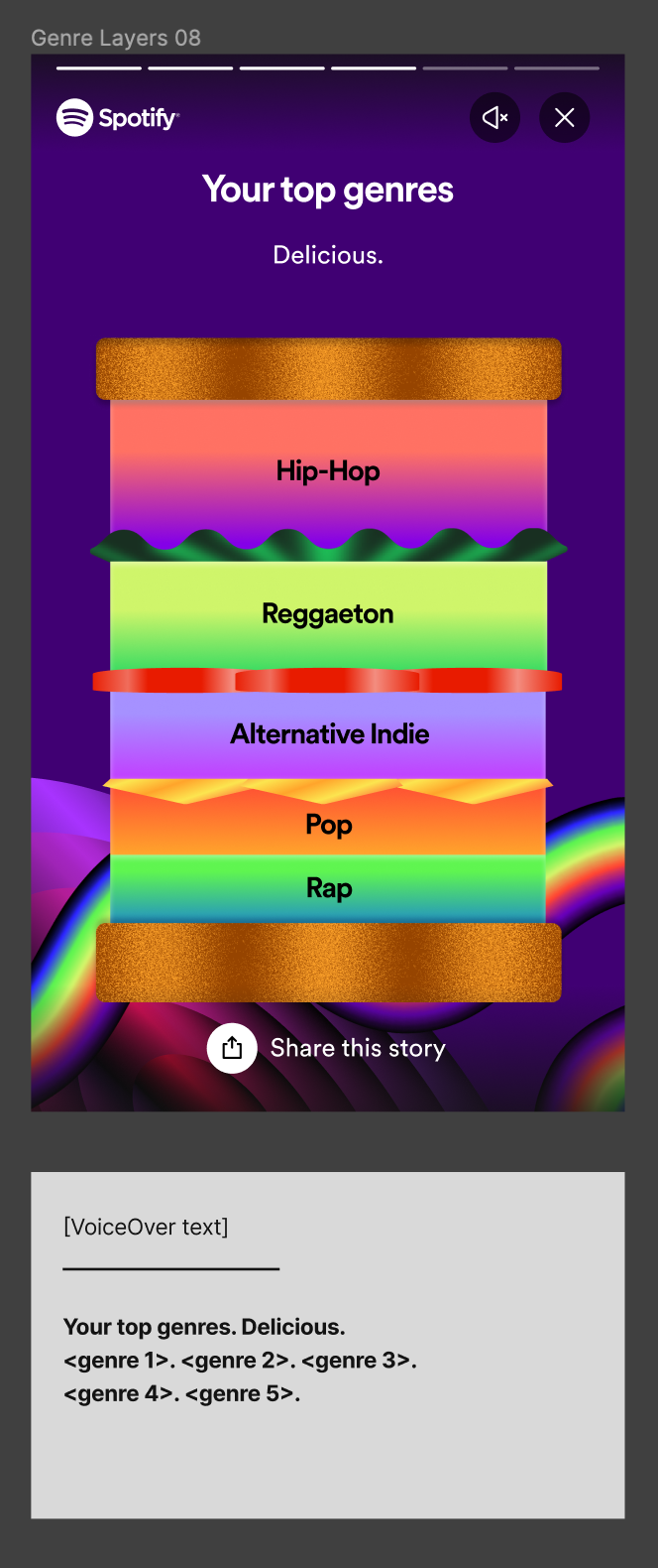
And while the final result is loading, the screen is effectively empty for them. But our content designer’s proposal fixed that issue. We configured alt text for an image that could have easily been considered decorative to improve the experience.
Ship it!
After development, one of the most crucial parts of the pre-launch tasks was making sure we integrated accessibility into our quality assurance processes. We created documentation and guides for testing accessibility and it was prioritised as part of our testing sessions.
We also asked ourselves the question: How do we know the quality of what we built and measure success? As mentioned earlier, we have made strides in aligning with our WCAG standard targets. We have also been tracking the Wrapped bug board for accessibility issues. To get real-life user perspective, we partnered with Fable, a service that allows us to test with real users. The test results highlighted some key wins, such as the importance of handling reduced motion setting by showing a static story – scores from tests jumped significantly with reduced motion enabled (e.g. in one test, we scored 58/100 with the regular story and 100/100 with static story!).
On November 29, we successfully launched Wrapped and our work didn’t go unnoticed. The accessibility features we built got picked up almost immediately. We got multiple praises from the community, including the RNIB (Royal National Institute of Blind People) praising our work. While it’s hard to gather quantitative feedback, these responses show the value of accessibility efforts. This was also surfaced to many other affiliated networks, increasing our reach within these communities and their networks.
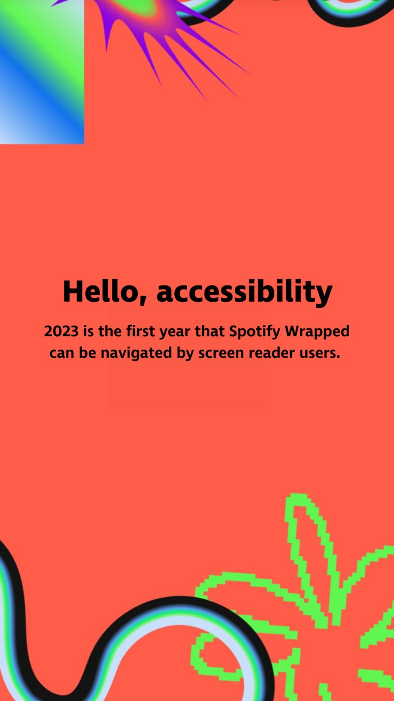
Image shared by RNIB
We also took the time to reflect. While we have achieved our goal of building the most accessible Wrapped yet, we recognise there is always room for improvement. We aim to enhance the experience each year. For instance in 2022, we focussed on user safety by respecting animation settings on the user’s phone. This year, among other improvements, we improved the screen reader experience, created consistent handling of reduced motion and improved visibility of the controls.
We’ve collected feedback and wrote up our learnings and potential improvements for next year. We have feature ideas, such as improved navigation (i.e. navigation within the stories, between scenes of a story and removal of auto-resumption in screen reader mode), magic-tap-like support for Android and web and taking advantage of haptic feedback to make the experience more immersive. Improving the auditory experience by means of proper captioning and dynamic storytelling would include an even greater number of users. We also have ideas for process improvements, such as a clearer prioritisation of issues.
With these, we are hoping to build the most accessible Wrapped yet again next year, go beyond the must-haves, and build a great experience for everyone, so that everyone can take part in this amazing celebration of listening. If Wrapped is about anything, it’s about celebrating our users for who they are.